This page uses javascript to help render elements, if you have problems please enable javascript.
 
You are now inside the main content area


left col

Editor Styles

These styles are found in the drop down styles menu for content editing.  Unlike section styles where the style codes go in the CSS section, these styles are applied directly to the elements within your content.

right col
 
 
left col

Using the styles

In the editor on the second row there are two dropdown menus that start with Paragraph then Styles.  The styles drop down is our focus.

To add or remove any style, click on the element, then click on the Styles drop down menu and choose something.  Any style that is currently being applied will have a checkmark next to the style name. 

styles dropdown is highlighted 
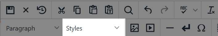
The dropdown Styles menu found in the editor toolbar.
right col
 
 
left col
right col

Special Title Style

Titles (not html headings h1 - h6)

Titles can make accordions, tabbed content, and also to help draw attention without needing to use a true heading element.  

In accordions and tabbed content titles are used to indicate a new accordion or tabbed content area.  Content after the title is put into the drop down area until a new title is declared.  You can have multiple accordion or tab groups within the same editing section.  Read the styles on accordions/tabbed content for more information.

In the edit mode you'll see [title] appear next to your text, this will help you recognize which part of your content is marked as a title.

Accordion, Tabbed Content, Title Example

Text Styles

The Stand Out Text style was developed to act like a lead in for your content.  This style works great under a main heading or as a piece of content that acts like a call out or side note.

Stand Out Text Example


The Stand Out Block adds extra room around your content and makes it stand out from the regular paragraph elements on your page.  This is one of those examples where it can be used with multiple styles to help make something that catches the users eye.

Stand Out Block Example


Do you want to make something emphasise without making it huge, bold, or isolated, welcome to larger text.  This does exactly what it mean the text is just slightly larger than the standard paragraph text.  You can of course make it bold if you want.

Larger Text Example


You don't always need to go big or go home, sometimes you need to add a little context without making it shout in the face of your users.  Smaller text can be just as effective providing subtext to your content without getting in the way of what you really want people to focus on.  This is great for sub-text over titles.

Smaller Text Example

Notification Styles

We have 6 different notification types for you to choose from.

- Notice 1

Depending on your theme notice 1 might look a little different but it typically will be the color border on the left.  Notice 1 is useful to add content where you need to point out critical information, add clarification, or make sure that people don't just skip over that content.

- Notice 2

This is the alternate theme to notice 1, the same advice for its use applies.

- Notice Default

Notice Information

Notice Alert

Notice Warning

Notice Success

These are specific format which will automatically place the icon on the left and your content on the right.  If you want to have multiple lines in this make sure you use the line break, or you can add this style to the CSS class of any section to have every element within that section part of the notice.

Background Colors

The theme colors will dictate what actual value is used; however, the standard of background 1-6, black, gray, and white are consistent with any theme.  If you haven't reviewed our better living with themes page you should check that out for more information. 

Text color is controlled by the background and will automatically adjust for dark mode.

Use these on any of the section CSS and it will color the entire section with the background/text color combination.  You can also assign them to single elements within any section.

Background-1: Primary Color

Background-2: Secondary Color

Background-3: Neutral Color

Background-4: Dark Color

Background-5: Accent 1

Background-6: Accent 2

Background-black: black

Background-gray: gray

Background-white: white

Each of these has been tested and will pass color compliancy for color contrast accessibility requirements.

Corners

Corners by themselves won't do much.  Without a background color or some kind of border you wouldn't notice a change.  The examples below use simple color backgrounds to show off the effect, any color will work the same.

Rounded Corners Example

Pill Corners Example

Padding & Margins

By default we have set the padding and margins around all your elements to help keep content easy to read.  Headings, paragraphs, images, and other content all will have their own padding and margin sizes.

Padding

Padding is the space inside of an element.  If you wanted to have content that is surounded by a border and have the image go 100% of the width then you will need to remove the padding around it. In the examples below we have put a color background so you can see the difference.

Regular padding around content

Removed padding around content


Margins

The margin defines the space outside of an element.  This is usually invisible as background colors and lines are not included in the margins but it can impact how content is related spacially.

small text with normal margins

stand out text with normal margins

You can see above the text don't feel like they are connected as a single idea.  If we remove the margin bottom of the small text, then remove the margin top of the stand out text, it looks much different.

small text without bottom margin

stand out text without top margin

Now the two items feel like they are part of the same idea without losing their padding.