This page uses javascript to help render elements, if you have problems please enable javascript.
 
You are now inside the main content area


left col

Background Images

You can add images to your page by using both boxes and sections.  The layout tool can help arrange the structure of your page so the placement of content over an image makes sense.  Background images exist as a wallpaper and not as true content for users.  Do not use backgrounds to convey instructions, event information, or critical process information, that must be written within the page contents.

right col
 
 
left col

Boxes and Sections

The layout for any html content page within the Campus templates is 5 boxes with 10 sections in each box.  The layout editor can help you arrange the sections into whatever arrangement you need but you can not add more boxes or sections to the page directly.

Boxes can have background images applied to them and the image will be applied behind all sections within it.  These backgrounds will go 100% of the screen width extending beyond the main content area.  We have a breakout row style that can create box like appearance if you need to add additional images that go 100% of the page width.

Sections can also have images applied to their backgrounds but the images will only extend to the confines of that section.  This is helpful if you have something like a topic link style or want to highlight a specific section with an image.

Add a background image

page manager editor buttons

While in Edit mode inside the edtior you'll find the page manager tool bar across the top.  There are two buttons towards the left side that help open and close the layout editor and the background images.

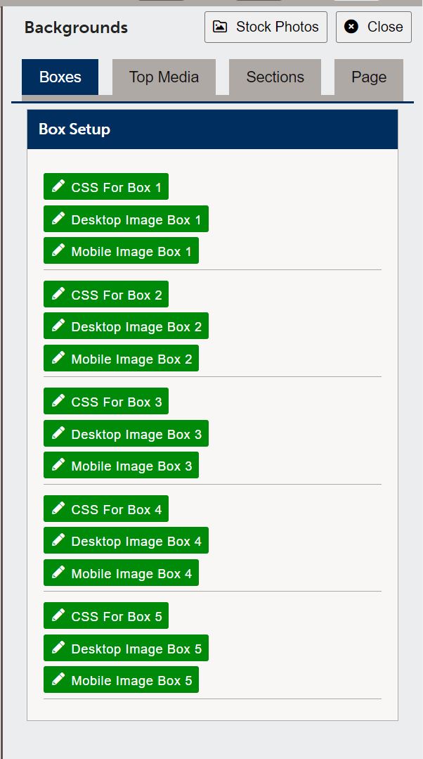
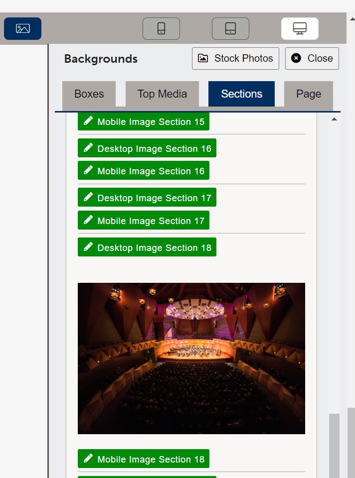
Open the background images to see the options you have for the page.  There are many areas that you can use to style a page.

page manager background editor


right col
 
 
left col

Backgrounds Editor

The backgrounds editor has links to the current stock photos, and tabs for boxes, top media, sections, as well as page level.

The Boxes tab will have editors for CSS, desktop image, and mobile image for each of the 5 boxes on the page.  You can add stock photo classes to boxes by using the CSS editor.

The top media will have desktop and mobile image editors.  Remember to use top media it needs to be activated within the page properties.

The sections will have desktop and mobile image editors for each of the 50 sections, if you want to use a stock photo for a section you can simply add it to the style editor right on the page.

The page level is used for CSS classes and will allow you to manage the entire page (except header / footer areas) background.  This is used in special cases and should be done with limited use.  There is no page level option to add images.

When using different images for desktop and mobile the page will automatically swap out the images when it detects mobile formatting.  If you do not have an image in mobile the desktop image will continue to be used.

Background image are not read by screen readers.  If you are using an image that contains important information like dates, locations, or instructions, those items MUST be included with the content on the page.

background image added to section

right col
 
 
left col
right col
 
left col

Box Backgrounds

Place an image or stock photo class within a box to create a full width image background.  This box uses stock-lh-3 and background-darker to create the background image.  It also has a height class of three-quarters to help with sizing.

right col
 
 
left col

Box background modifiers

By default images will have some darkening to help make it easier to read the text.  Depending on the image used this may not be dark enough.

Use these classes in the box CSS editor to help adjust the image contrast for easier reading by low vision users.

  • background-darker
  • background-lighter

Sizing and placement styles

You can also add padding and background image positioning styles to help adjust images.  See those sections for class names.

Remember that images are responsive to the screen, most images are set to cover and this does not guarentee that the whole image will be displayed on a users device.  Size will be dependant on the screen they use.

right col
 
left col

Section Background Examples

Below are three sections with different images.  The first and the third box use stock photos while the second uses a section background image.  We have placed a gap on this box to help separate the sections; otherwise, by default the images would be right up against each other.  The last section was left intentionally blank but has a height modifier of "half" used on it to help perseve spacing in mobile format.

right col


left col

Stock photo background with half height modifier added.

Image added to the background using the background editor.  There is no height modifier on this image, it will expand to fill the section based on surrounding content.

In mobile this will only grow as far as it need to fit this section content.

right col
 
left col
right col